
SUSHIMAKY
Responsive Website UX Design
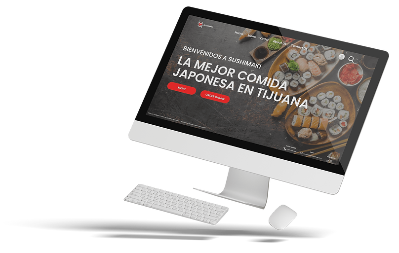
Project Overview
THE PROBLEM
Sell the food dishes of the Sushimaki restaurant through a website and app so that customers can easily purchase and inform about the services they offer
THE GOAL
Design a website and an app for Sushimaki that allows you to sell your food and provide information about what you sell in your restaurant.
Attract new potential customers to visit your restaurant.
THE PRODUCT
Sushimaki is located in the city of Tijuana B.C., it strives to offer the best Japanese dishes in the city. Offering a wide variety of accessible and competitive prices.
Sushimaki targets customers who are passionate about Japanese food and new customers who want to learn a little about Japanese culture.
MY ROLE
UX designer designing an website and app for Sushimaki from conception to delivery.
RESPONSIBILITIES
Conducting interviews, paper and digital wireframing, low and high-fidelity prototyping, conducting usability studies, accounting for accessibility, and iterating on designs
PROJECT DURATION
October 2021 to November 2021
Understanding the user
I conducted interviews and created empathy maps to understand the users I am designing for and their needs. A main group of users identified through the research, were users with a just towards Japanese food or users who want to try new foods.
This group of users confirmed initial assumptions about Sushimaki's customers, but the investigation also revealed that finding a good Japanese restaurant in town was not the only factor limiting users from visiting the restaurant.
Other user problems include lack of knowledge, interests or challenges in the difficulty of buying Japanese food or going to the restaurant in person.
USER PAIN POINTS
Time
Users are busy with their daily activities, making it difficult for them to visit a Japanese food restaurant or they don't know where there is a Japanese food restaurant in the city.
Accessibillity
Japanese food shopping platforms are not equipped with customization of food dishes.
IA
Japanese restaurant pages are not well designed, which makes navigation difficult.
Text-heavy menus in apps are often difficult to read and sort
PERSONA AND PROBLEM STATEMENT
Michelle Silver
Michelle Silver is a freelance design worker who needs to order food at the restaurants she visits often, because she goes out with her friends to eat to relax.
![Google UX Design Certificate - Persona [Template].png](https://static.wixstatic.com/media/1363bd_3a4a52190f0941bbb150119e2562f520~mv2.png/v1/fill/w_629,h_354,al_c,q_85,usm_0.66_1.00_0.01,enc_avif,quality_auto/Google%20UX%20Design%20Certificate%20-%20Persona%20%5BTemplate%5D.png)
USER JOURNEY MAP
Michelle Silver's user journey mapping revealed how useful it would be for users to have access to a dedicated Sushimaki website and app.
![Google UX Design Certificate - User Journey Map [Template].png](https://static.wixstatic.com/media/1363bd_93c00f34d0ab407694996e73d3d39ec4~mv2.png/v1/fill/w_629,h_354,al_c,q_85,usm_0.66_1.00_0.01,enc_avif,quality_auto/Google%20UX%20Design%20Certificate%20-%20User%20Journey%20Map%20%5BTemplate%5D.png)
Starting the design
SITEMAP
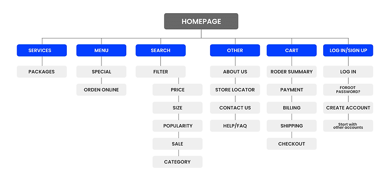
The challenge that was presented was the navigation and the visual aspect of the website, it was a main pain point for the users, so a site map was generated.
My goal here was to make strategic information architecture decisions that would improve overall website navigation. The structure I chose was designed to make things simple and easy.
PAPER WIREFRAMES
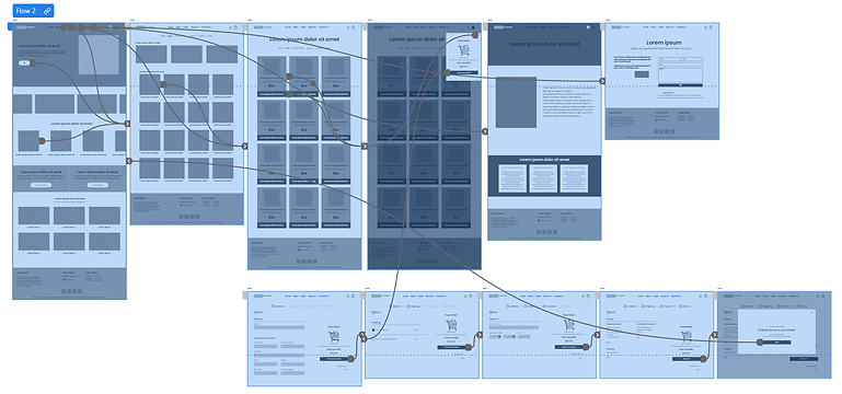
Using the completed set of digital wireframes, I created a low-fidelity prototype. The primary user flow I connected was finding an item and placing it in the cart, so the prototype could be used in a usability study.
WIREFRAMES
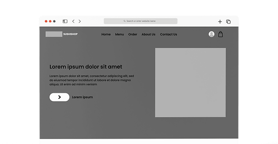
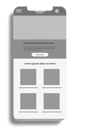
SCREEN SIZE VARIATIONS
Next, I drew a wireframe on paper for each screen on my website, taking into account user pain points about navigation, and checkout.
Variations of the home screen wireframe focus on the efficiency of the users' browsing experience.
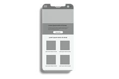
Because Sushimaki's customers access the website on a variety of different devices, I began working on different layouts for additional screen sizes to ensure that the site would be fully responsive.
DIGITAL WIREFRAMES
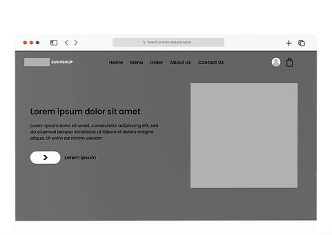
Moving from paper to digital wireframes made it easy to understand how the redesign could help address user pain points and improve the user experience.
Prioritizing useful button locations and visual element placement on the home page was a key part of my strategy.
SCREEN SIZE VARIATIONS
LOW-FIDILITY PROTOTYPE
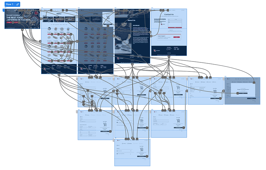
To create a lo-fi prototype, I connected all the screens involved in the main user flow of adding a meal to the cart and paying.
At this point, I had received feedback on my design from external users. I made sure to listen to their feedback and implemented various suggestions in places that addressed user issues.
Usability study: Findings
I conducted two rounds of usability studies. Findings from the first study helped guide the designs from wireframes to mockups. The second study used a high-fidelity prototype and revealed what aspects of the mockups needed refining.
Study type:
Unmoderated usability study
Location:
Mexico, TJ, remote
Participants:
5 participants
Length:
8-15 minutes
ADD TO CART
01
Once at the checkout screen, users didn't have a way to edit the quality of items in the cart.
ACCOUNT
02
During the checkout process, there was no clear way for users to log into their account to pre-fill in the above billing and shipping information.
PAYMENT
03
Users wanted other forms of payment to be able to make their purchase.
Refining the design
MOCKUPS
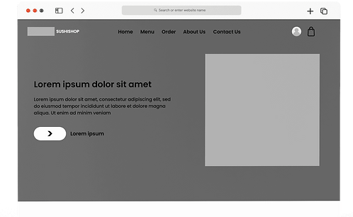
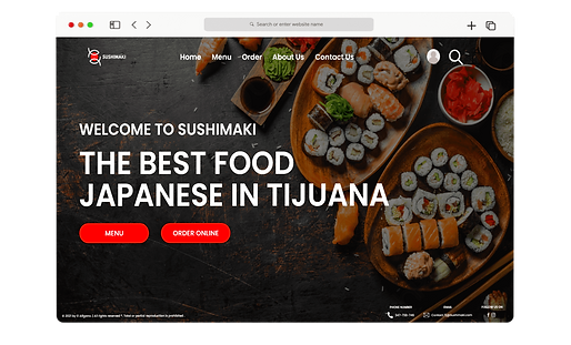
Based on the information from the usability study, I made changes to improve the start of the site. One of the changes I made was adding 2 key buttons. This allowed users to navigate users much faster.
HIGH-FIDELITY PROTOTYPE
The high-fidelity prototype followed the same user flow as the low-fidelity prototype, including design changes made after the usability study.
ACCESSIBILITY CONSIDERATIONS
1
Access to a simple and easy-to-use online store gave users an easy way to purchase their food, without the need to wait for someone to take their order.
2
Detailed images of the products were used to help all users better understand the designs.
3
Icons were used to facilitate navigation.
Going Forward
TAKEAWAYS
Impact:
The website makes users feel like Sushimaki really thinks about how it solves their needs.
A quote from the peer comments:
“The website is very simple and easy to use, I can place my orders without any problem. I would definitely use this website to do my food shopping. "
What I learned:
While designing the Sushimaki website, I learned that the first ideas that are had for the design are only the beginning of a process to reach a final result and that the user can interact satisfactorily and without difficulties. The usability studies and peer feedback that were carried out helped to understand how users interact with the designs and functions of the web page.
NEXT STEPS
1. Research
Conduct another round of usability studies to validate whether the pain points users experienced have been effectively addressed.
2. Features
Identify additional areas of need and come up with new features.
3. Rewards
Research will be carried out on whether it is necessary to improve the design of the application to make it more comfortable to navigate.
Try it Yourself!
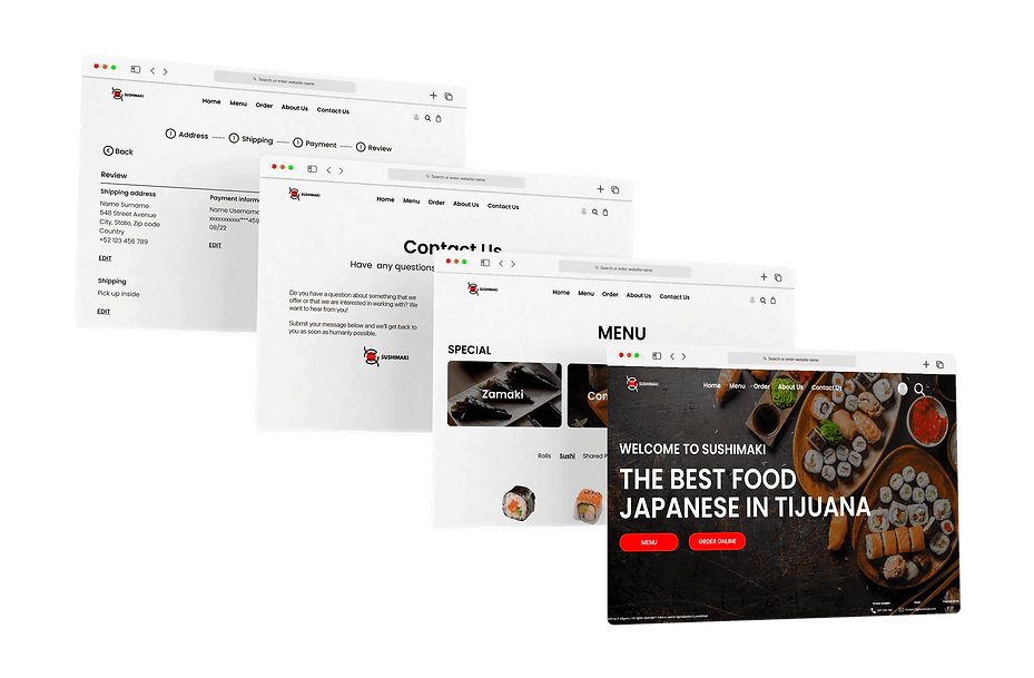
Click on the button below to use the prototype of the app.

Thank You!
Thank you for your time reviewing my work on the Skate shop app! If you’d like to see more or get in touch, my contact information is provided below.