
SkateTJ App
Mobile App UX Design

Project Overview
THE PROBLEM
Sell your skateboards from a mobile application so that your customers can more easily purchase skateboard products, without the need and physically go to the store.
THE GOAL
Design an application for SkateTj that allows you to sell your products and provide information about the world of skateboarding.
Attract new potential customers to purchase products.
THE PRODUCT
SkateTj is a small regional company located in the city of Tijuana B.C. SkateTj strives to offer skateboards and a wide variety of accessories. Offering a wide spectrum of competitive prices. SkateTj targets customers such as passionate and potential new customers who do not have a place to purchase skate products.
MY ROLE
UX designer designing an app for SkateTj from conception to delivery.
RESPONSIBILITIES
Conducting interviews, paper and digital wireframing, low and high-fidelity prototyping, conducting usability studies, accounting for accessibility, and iterating on designs.
PROJECT DURATION
October 2021 to November 2021
Understanding the user
I conducted interviews and created empathy maps to understand the users I am designing for and their needs. A main group of users identified through the research were young people who are passionate or who practice the sport or people who want to start in this world of skateboarding.
This group of users confirmed initial assumptions about SkateTj's customers, but the investigation also revealed that finding a store in the city was not the only factor limiting users from purchasing such products.
Other user problems include lack of knowledge, interests or challenges in the difficulty of buying a skateboard or going to the store in person.
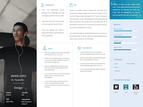
PERSONA AND PROBLEM STATEMENT
Sarah Jackson
Javier Lopez is a busy young student who needs easy access to options to buy skate products because he doesn't have time to shop for himself.

COMPETITIVE AUDIT


IDEATION
Taking the time to write iterations of each application screen on paper ensured that the elements that made it onto digital wireframes were adequate to address user pain points. For the home screen, I prioritized a process of finding products more easily, to help users save time.

Stars were used to mark the elements of each sketch that would be used in the initial digital wireframes.
Starting the design
DIGITAL WIREFRAMES
As the initial design phase continued, I made sure to base screen designs on feedback and findings from the user research

LOW-FIDILITY PROTOTYPE
Using the completed set of digital wireframes, I created a low-fidelity prototype. The primary user flow I connected was finding an item and placing it in the cart, so the prototype could be used in a usability study.

Usability study: Findings
I conducted two rounds of usability studies. Findings from the first study helped guide the designs from wireframes to mockups. The second study used a high-fidelity prototype and revealed what aspects of the mockups needed refining.
Study type:
Unmoderated usability study
Location:
Mexico, TJ, remote
Participants:
5 participants
Length:
10-30 minutes
MAP
01
For most users, it was not very clear if there were other forms of payment
CONTACT
02
For most users, it was unclear if they were adding the products to the shopping cart
DONATE
03
For most users, they did not know if they had purchased the product
Refining the design
MOCKUPS
Based on the insights from the usability studies, I added a map feature to the app to allow users to see if the organizations were close to them.

HIGH-FIDELITY PROTOTYPE
The high-fidelity prototype followed the same user flow as the low-fidelity prototype, including design changes made after the usability study.

ACCESSIBILITY CONSIDERATIONS
1
Access to users with language problems was provided through an option to change the language of the application.
2
Icons were used to facilitate navigation.
3
Detailed images of the products were used to help all users better understand the designs.
Going Forward
TAKEAWAYS
Impact:
The application makes users feel that SkateTj really thinks about how it solves their needs.
A quote from peer comments:
“The app made it easier for me to find the products I was looking for. I would definitely use this app to make my skateboard purchases. "
What I learned:
While designing the SkateTj application, I learned that the first ideas that one has for the application are only the beginning of a process to be able to reach a final result and that the user can interact satisfactorily and without difficulties. The usability studies and peer feedback that were conducted helped in understanding how users interact with the application designs.
NEXT STEPS
1. Research
Conduct another round of usability studies to validate whether the pain points users experienced have been effectively addressed.
2. Features
Further user research will be conducted to determine if there are new areas of need for users.
3. Rewards
Research will be carried out on whether it is necessary to improve the design of the application to make it more comfortable to navigate.

Try it Yourself!
Click on the button below to use the prototype of the app.


Thank You!
Thank you for your time reviewing my work on the Skate shop app! If you’d like to see more or get in touch, my contact information is provided below.